Coolors
Objective
Using the methods learned about UX, we conducted user experience research for the site Coolors. The overall goal was to test the effectiveness of the site and gain insight into what was and wasn’t working.
UX Research
Software
n/a
Date
August, 2024 - December, 2024
Team
Sammi Meyers, T Dahbani, Mihir Tamrakar,
Kien Nguyen
Contents:
Heuristic Analysis
Usability Testing
In-depth Interviews
Coding & Affinity Diagramming
Persona Development
Empathy Mapping & Journey Mapping
Design Personality Development
Competitive UX research
Card Sorts (tree tests and first-click testing)
Resarch Objectives
Research Objective 1: How do people choose a certain graphic design tool?
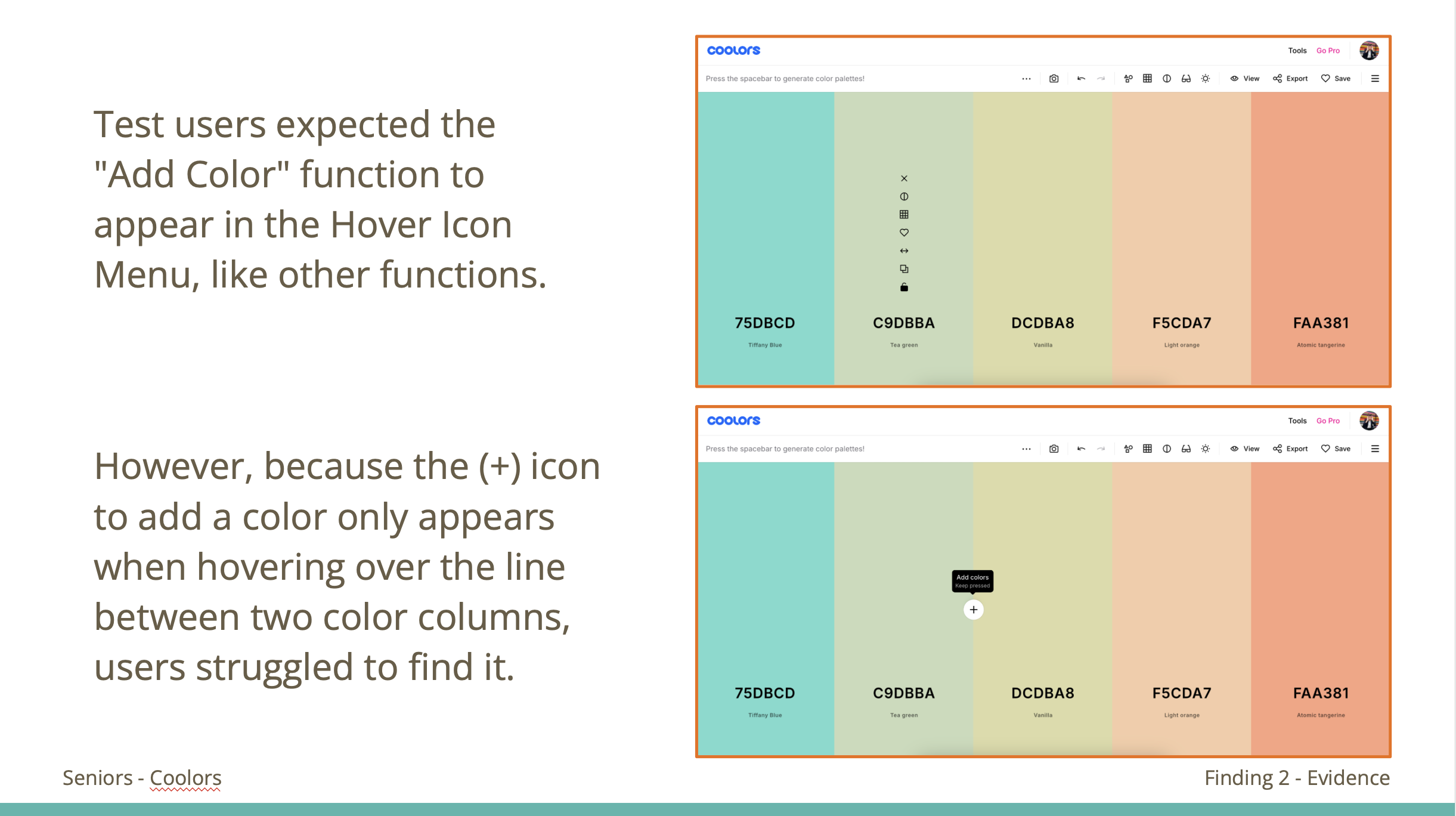
Research Objective 2: Identify the challenges users face when accessing and using advanced design features
Research Objective 3: Figure out what makes a desirable graphic design tool
Research Objective 4: Analyze how varying levels of design expertise impact user expectations, feature usage, and satisfaction with graphic design tool
Heuristic Analysis
By applying Neilson’s Heuristic Process to our research, we found that the site isn’t actually as good as it might appear to the naked eye. While it wasn’t either terrible or perfect, there were problems.
Filling out this scorecard allowed us to see where some of the problem areas were, including the site’s use of navigation and icons. Scores on a scale of -2 to 2 were used to rate each category.
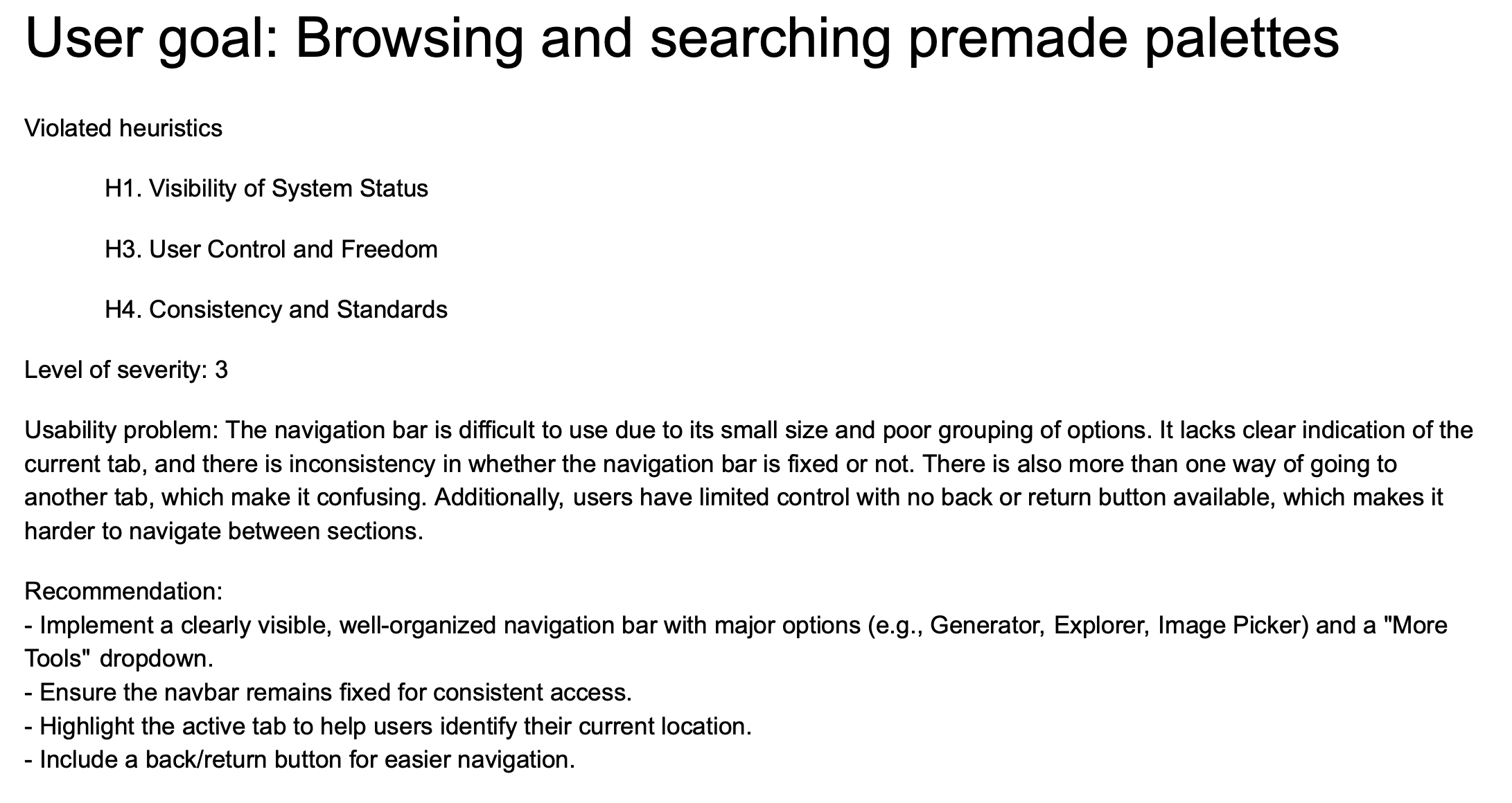
When it came to using the research goals previously identified and comparing them against each of the heuristics, some of the things noticed involved the navigation bar (as seen in the example above). It violated at least three heuristics, proving that it was a significant problem. Due to this, we knew it was a problem that needed to be addressed.
Usability Testing
Before conducting our usability testing, we created a script based on our objectives and the insight we hoped to achieve. We also created an example of the think-aloud procedure that our interviewees would follow.
After creating each scenario, we tested the scripts on our other classmates. That allowed us to see what parts of our script worked and what didn’t. For the most part, the script was good; we just needed to focus on the wording and clarity of our tasks to not give away what we were hoping to achieve yet help guide them in the general direction.
Script:
Final Conclusions:
This is the tool that we used to compile our findings.


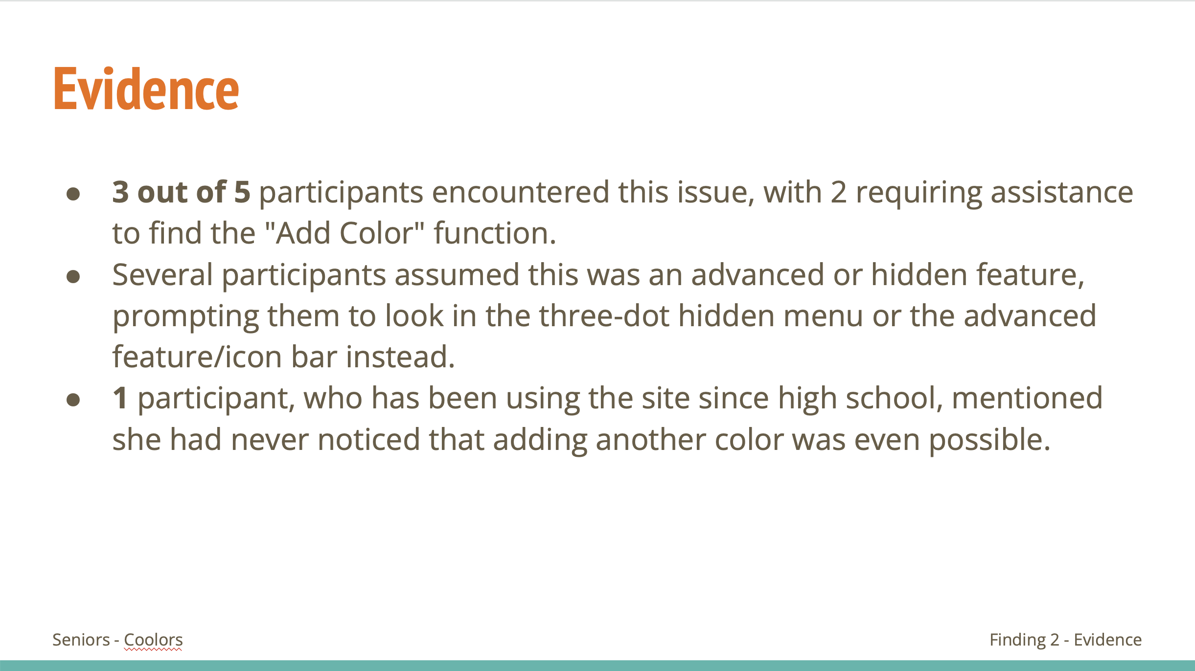
Through the act of interviewing, it allowed us to see and understand the user’s thought process behind their actions. It was able to reinforce our thoughts about problem areas as the more wrong turns, help needed, and failures of a task showed that there were problems that existed.
In-Depth Interview
At this stage, we interviewed a participant about design tools in general, not specifically Coolors but in a way that would inform our research with Coolors. We compiled a series of questions and goals we wanted to achieve. Similar to previous tasks, we started with testing on our classmates before revising for the real interview with a participant.
This interview was very informative as it allowed me to dig deeper into the user's motivations. I interviewed someone who is studying graphic design as I knew it would provide accurate knowledge and information for our research. Our interview lasted around 30 minutes and included both prepared and unprepared questions.
Coding & Affinity Diagraming
After transcribing the interview I conducted, I then went through it to find key ideas that seemed significant. To help with clarity, I highlighted similar ideas with the same color.
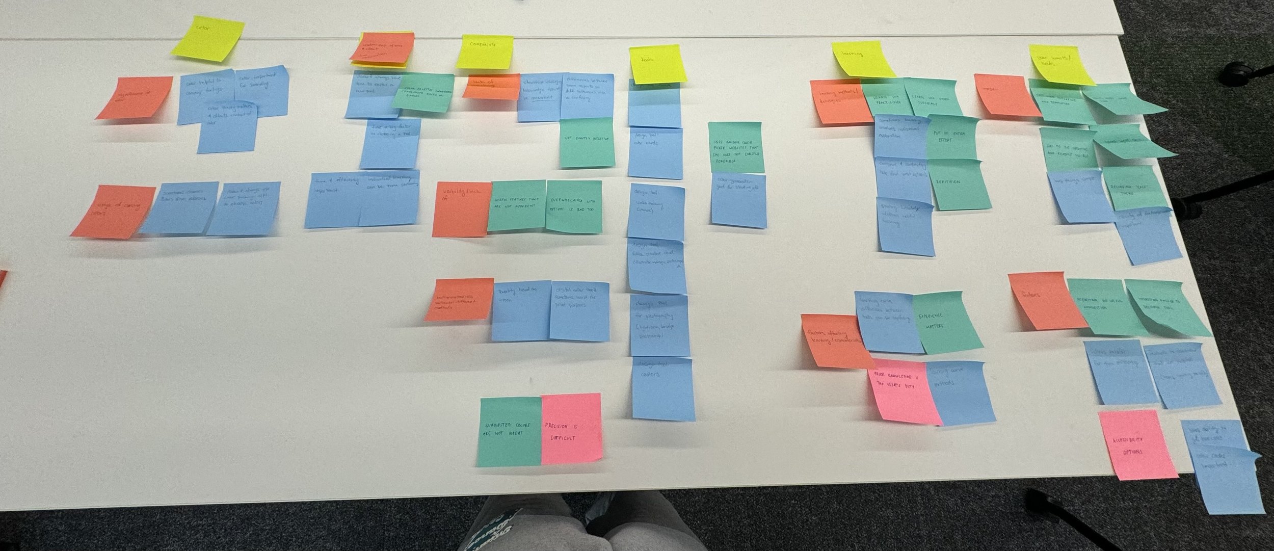
Once the coding was done, we compiled all the different trends we found in affinity diagramming. This is when we tried to create categories for all the various key ideas we identified in the coding. We used the yellow sticky notes to identify the categories and the orange sticky notes for the subcategories to make them more specific.
Coding:
Affinity Diagramming:
Some key takeaways from these methods included the aspect of time and efficiency being of great importance to the user. When using a tool, they want something helpful, but as they are often busy, they don’t have tons of time to spend learning a new tool or using one that is challenging. Besides what we learned from this process, there is also value in them as it is a form of visualization to help organize our findings and thoughts.
Persona Development
This phase included making a persona (Casey Brooks). This allowed us to begin to think about the site from her point of view, seeing her motivations and goals. It was quite an interesting process to do as we wanted to make it as realistic as possible to provide the most insight. This meant including details to her that made her feel real, like a full name and how her growing up influenced her.
Empathy & Journey Mapping
Creating a persona then led to creating an empathy map and a journey map to further gain her perspective as she would use the site.
Empathy mapping allowed us to hone into the more emotional side, thinking about her feelings, actions, and what she says and thinks.
Journey mapping then allowed us to visualize these themes in another way and in terms of how she would interact with site.
Through mapping, we were able to conclude that sometimes less is more for newbies, as ease and efficiency are very important. This reinforced ideas we had previously concluded. By applying the persona, we can gain a better understanding as to why they might be important, as it causes us to think from a perspective other than our own.
Design Personality
The purpose of creating a design personality for the site is a way to see how we can effectively convey aspects like tone and style throughout the site. With this in mind, we created the mascot Cam the Chameleon to embody the playful, positive, and quirky personality we believe the site would possess.
Competitive Research
We compared Coolors to some of its competitors. Part of the process was identifying dimensions that would be helpful in learning what the competition does well, gaps at coolors, and ways to improve.
Competitors: Color hunt, Adobe Colors, Colormind, Paletton, Happy Hues
Identify dimensions for Coolors
Aesthetically pleasing
Colors: it’s dark, which could be intentional to make the colors pop, but
Fonts: standard, neutral font
Tone: pretty formal, fitting for the website
Graphics/visuals: change of colors according to the generated palette, cool concept, not as lively as the coolors interface
whitespace/layout: good for the most part, I like the animated transitions, whitespace at the bottom (the links part)
Navigation
Navigation bar: Better utilization of navbar, clearly visible options
Instructions:
Pointer giving directions:
Personalization
Sign in/ sign up: no login, only the website socials linked in the nav bar
Your saved items
Color Palette Generation Features
Browsing existing palettes: It is underneath the home page but I don’t see a search for exploring templates
Random Color Generation: generate button clearly instructs the user
COLORMIND
Strengths of competitor
Navigation: Better utilization of navbar
Unique solutions competitor
A visualized website using the palette right under the palette generator
Gaps in the site’s content, information, and features
Kinda confusing how the site works, with it visualizing the palette
Looking at a competitor of Coolors allowed us to see how the two sites compare and how they might convey similar features. The point of this was to see how we can differentiate and stand out. We also found how things that we might have liked or disliked about our site were reinforced by looking at its competitors. For example, preferred Coolors because of the content they possess and the overall feel of the site being brighter and friendlier than Colormind.
Card Sorts
While we didn’t have time to apply these methods to our site, we still learned and conducted tree tests and first-click testing. Through these methods, we were able to experiment with how the organization of a site is conducted.
Eurostar Tree Testing:
Conclusion
Overall, I learned what goes into user experience research and have gained a new respect for it. It takes a lot of time and effort, causing a great need for patents. However, it is very important for the success of a site. Having done my own testing on a site that exists that appeared good at a glance, it was very interesting to see how there were more problems than I anticipated. I at first thought that our choice of site would have been too easy, but it was actually quite interesting to learn what could have been improved, especially since I was very familiar with the site prior to our research on it.


